
iOS7 announced
During a WWDC keynote that has to be the biggest one in recent years, the moment we had all been waiting for finally arrived… the announcement of iOS 7. With Jony Ive at the helm of the interface, there was great anticipation of just what the new iOS would look like.
The new look of iOS is both radical, yet feels familiar. What stayed was the familiar grid of (new) icons. What went was skeumorphism, inconsistency between apps and fiddling around with the settings in order to turn wifi on and off.
Yes it was undoubtedly what many were hoping for, if not beyond most expectations. So lets start by talking about the interface.
First off, I have to confess I was never on the skeumorphism hate bandwagon. I didn’t mind it. I didn’t love it however. Sure it adds a certain comfort factor, but it also can lead to clunky design. Now it’s gone and in it’s place is something I’ve championed for years – clean design. iOS 7 is fresh, using a predominantly white scheme with colours used to emphasise key elements, rather than colour being everything.
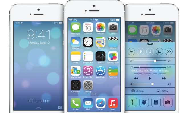
Newly added to iOS, as can be seen above, is Control Centre. This allows you to turn on Wi-Fi, Bluetooth, Airplane mode etc, all without having to enter the settings app to do it. Apple has also included a torch option which is always handy and nice to see supported at OS level.
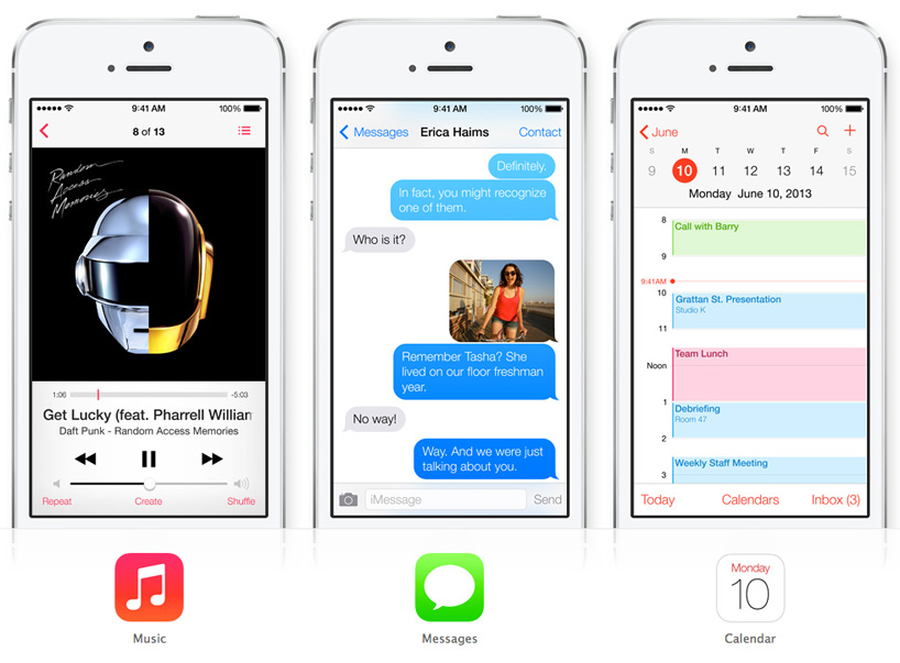
Calendar and Messages look much simpler and more refined too, don’t just take my word for it have a look below
There’s more to iOS 7 than just an interface overhaul however. Features like iCloud keychain, proper multitasking that adapts to your app usage, AirDrop and iTunes radio are just a few of the additions to iOS. For the first time in a couple of years, the future of iOS looks bright.
More analysis to follow…